Pages

Thursday, June 30, 2011

07/01 July SOTM Blog Hop

Are you ready for the next holiday??? OK - so where did the month of June go? For me I was busy with family and end of the year school activities! But now bring on summer with all of the food and fun of this holiday!! AND I am all ready for the pictures that I will take- how about you?


If you have been hopping with us you have arrived from Wanda's blog
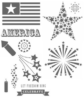
and you have been inspired by her terrific design! This month's SOTM is D1458 American Celebration and did I tell you that I am all ready for my photos?!!


Here are my completed pages - ready for the photos

Left page


Right page

Link

Did you notice how I cut the fireworks stamp in half and used it to border my paper? EZPZ - try it - you'll like the effect!!

Supplies:
SOTM stamp set D 1458 American Celebration
X7138B Fanfare Level 2 paper pack
X7138C Fanfare My Stickease
Cranberry Ink
Outdoor Denim Ink
Star brads

Be sure to check back AFTER the holiday to see the finished layouts... but for now hop over to Pamela's blog to view her festive design.

Happy 4th of July to everyone!!!!

Wednesday, June 15, 2011

June's CTMH Product Blog Hop

This month's hop is something I have never participated in or even thought of before! But it was a fun experience and I am glad I was part of it. But if you 'happened' upon my post, this time you need to start at the beginning and visit Nikka's blog here. Each of us received an inspiration piece and used that design as a springboard for our interpretation of the art piece.

I was the first participant in the "Relay Race" and the inspiration for my design came from this page that Nikka created. I started with the theme of the design first and then selected my colors.


I loved the butterflies and decided to keep them on my layout but changed the color from Olive to Pear and then I accented the page with Sunset, Gypsy and Black.


I am using this layout as the front page of my son's wedding album and so I thought "2011 Memories" was the perfect title for the album. The sponged butterflies and discs are Pizzazz Irresistibles from my stash and I added a few butterflies from the retired "Just Blooms" Spring set.


I created a border at the bottom with the Kraft Color-Ready Borders (Z1377) and finished it off with a Just Blooms flower sponged in Sunset and a Pear brad.


Now it is on to Haley's blog here to see how she interpreted my design. This hop should be an inspiration for all of you to join in next time! Just think of the creative possibilities......

Wednesday, June 8, 2011

Personalizing Your Layouts

Are you laughing yet at the date of this layout?? I am!! All I had were 5 photos to commemorate my youngest son's first Halloween. Not the digital quality of today and certainly not the 20 I would take today if I was able to relive this event!!


After watching this CTMH video, I was challenged to create a more personalized layout rather than than using the basics.


Kit: Hooligans
Pattern: Defining Moments
How I personalized this layout: I enlarge the main photo and cropped the smaller ones to fit the photo wells. I changed the color of the base paper from White Daisy to Pear and distressed it. I added multiple 'stars' and 'eyeballs' to embellished the layout.

Now I feel brave enough to tackle additional layouts and make a WOWIE layout! Why don't you give it a try? Click here to make your own Studio J layout and receive a jpg FREE!! Offer good through June 30, 2011! Email me if you have any questions. enjoy!

Tuesday, June 7, 2011

2 Scrapbook Layouts in 30 minutes!

Kits: Route 66 and Spalsh Zone (Members Only)
Pattern: Zoom In (Members Only)

(click on pictures for larger viewing)


Same Layout - different paper packs and pictures!


Really? How is that possible?? Studio J - that's how!! Can you see the slight differences in the layouts?

Difference #1 - The "New Car" layout has one photo is the upper right hand corner BUT it is actually 2 photo wells in the layout! The "Cruise" layout has a photo in each photo well.

Difference #2 - The "Cruise" layout (L) has a vertical journaling box to the left of the main photo - the "New car" layout - I used the My Stickease for the year of the event.

Difference #3 - I used the My Stickease from the paper pack a part of my title for the layout. The text boxes were used with no background or mats allowing the photos to show through in the layout.

Difference #4 - The borders at the bottom of both pages are created slightly different. The "Cruise" layout has the border as set by the default in Studio J. The "New Car" layout - I used both borders and enlarged the blue striped border to 110%. The border on the left side I pulled off the page to the right to make it appear as part of the first layer of paper in the template. (Look at the Cruise layout under the large photo) I then added the second border on top of the striped border at the default size.

Difference #5 - The "New Car" layout ( lower R) has a "My Stickease" tag with journaling while the "Cruise" layout has a sticker from the "My Stickease" paper pack.

Difference #6 - The buttons on the "New car" layout are 'brought to the front' but in the "Cruise" layout they appear without any obstruction.

Follow along with this Close to My Heart video to learn how to blend two photos to create one large picture.


Stay tune for more studio J layouts, tips and techniques!

Monday, June 6, 2011

06/06 Studio J is FABulous!


(click on photo above for a larger view)

When was the last time you received a scrapbook layout for FREE?!! You can't remember - neither can I! This month Close to My Heart is offering a STUDIO J® FREE-FOR-ALL special. During the month of JUNE, CTMH is GIVING EVERYONE a FREE Studio J® JPG file—no purchase required!

All you have to do is to log on to Studio J here and create a layout. Then order a JPG file of your layout. It’s as easy as that! Download and save your file so you can post your layout online, email it to family and friends, or print them.

If you have a Studio J or a MyCTMH® account with me, just log in and start creating. If you don’t have an account with me you can easily create one or simply try it out. Just follow the online instructions that you will see on the screen after you click the Studio J button.


Here is a video on Step-by-Step Basics for getting started with Studio J


I must admit I was very leery at first because I love all of the buttons, ribbons, and embellishments. But be sure and stop back often during the month of June to see all of the FAB-ulous techniques you can do with Studio J and create layouts quickly and easily!