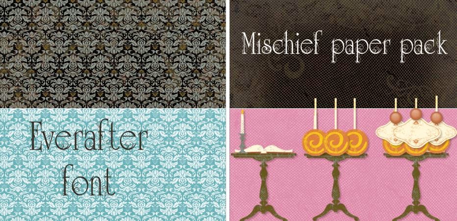
Studio J snippet #8 - Create a totally different look by changing the colors of a paper pack and creating a matching embellishment by mixing up the My Stickease elements.
Here is a layout I did for convention in 2012 in which I altered the colors of the paper pack and created a totally different design using the My Stickease.
Here is the example I used to create the layout using the Mischief paper pack in Studio J.
I changed the color of the paper on the left from black to Lagoon and the color on the right from black to Cotton Candy. I turned the lollipops stickers upside down and added a tag and a brad for the frosting and cherry!
I have also entered this layout in the H2H Challenge for this week "Inspired by ...Food!" You can find the linky here. Please join us - I am sure that you will find something to scrap about using a food theme!


3 comments:
I love everything about this layout. Just wish I could have been there to sample the tiramisu! Thanks for sharing how you made your dessert image from stickers. Great addition to the H2H challenge this week.
Wow, thank you so much for sharing your Studio J tips and tricks! Great take on the food challenge, thanks for playing along with H2H challenges!
This is such a great layout, so bright, colour and fun. Great job! Thanks for playing along with H2H!
Post a Comment